Behind the Say Front Brand
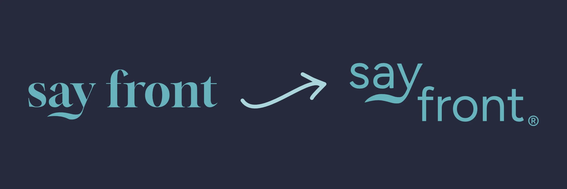
Say Front’s previous and current logo
From Serif to Sans-Serif: The Intent Behind Its Recent Refresh
With a brand name that is a tongue-in-cheek play on words, its previous logo did not match its true personality.
When I initially designed Say Front’s logo, I didn’t know who it was meant to serve. In 2024, logos were trending toward serif fonts, and I added to that trend while keeping elements of who I am.
The wave extending from the 'y' is a nod to my time as an outrigger canoe paddler. The stem of the letter doubles as a paddle, and the curve beneath it traces the water breaking as the blade glides through. The color inspiration came from a deep navy Maison Kitsune for Japan Airlines Amenity Bag. I wanted a color to pair with it that wasn't gold, and after some thought, I found it on my desk: a pencil pouch with similar dark blue fabric and aqua-colored zippers. I didn’t know it then, but my truest inspiration behind Say Front’s look and feel was where I lived: Long Beach, CA.
I started the business to solve a problem I faced—the lack of a strategic brand infrastructure that made every decision hard and forced me to rely on tactics to market the business I worked for. I knew I was skilled at taking what a business had and strengthening its infrastructure within 3 months, but I often didn’t know the business’s overall strategy. Strategy makes the difference, and I saw that in my own business when I first started Say Front.
Over time, I saw that Say Front needed a refresh because its serif-font logo was too sophisticated and rigid for what it really was: approachable, collaborative, and honest. Once I learned the name was successfully trademarked in April 2026, it was time to put these thoughts into motion.
The redesign took months and many logo versions
Color Palette

Each block's size reflects its share of the brand's color usage.
Starting with the colors, I kept the original palette I built over time, but added yellow for a pop of optimism.
I select colors through Pantone, a color system I became accustomed to while being in the interior design industry. I start the selection process with the Textile system because it names every color. We connect more with a name than with a code, and since Say Front is ocean-themed, every color ties back to the sea.
The primary colors are Maritime Blue (deep blue-black) and Cloud Dancer (cream white), with Seaport (deep teal-blue) and Clearwater (sky blue) as the secondary, supporting colors. Water Sign (aquatic teal) is used primarily on the logo and sometimes as an accent. Happy Hopes is the yellow that was noted earlier. It’s a sunlight-on-water type of hue that warms the cold blues.
Typography
For the typography, I chose Figtree for its rounded terminals and slightly geometric structure, as it feels friendly and approachable without feeling too casual. I use it for titles and headers to give Say Front its voice and personality. I kept Open Sans, the font I selected in the very beginning, as the body and reading font for its clear legibility at any size. Together, they balance Say Front’s personality. One gives it a voice, while the other ensures it's heard.
I chose fonts through Google Fonts to keep things simple. They show up on your website, work in your documents, and are accessible to everyone on your team, which means less friction and more efficiency.
Logo
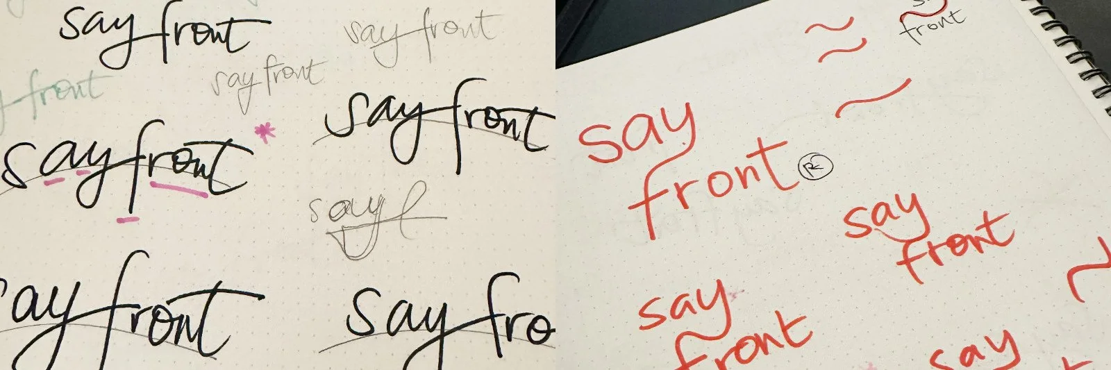
Endless concept drawings for the next Say Front logo
Finally, the logo. After weeks of trialing concepts that didn’t land, a simple thought crossed my mind on an evening walk with my dogs: a sans-serif version of the serif logo while retaining the wavy element on the ‘y’. But with all of the letters on the same baseline, it felt flat and boring. I went back to my other drawings and settled on a concept I already had: a stacked, staggered look that creates an asymmetrical two-line composition and visual movement.
The paddle may be gone, but the water remains. My original logo nodded to my years as an outrigger canoe paddler. Now, the wave stands on its own, a quieter nod to the ocean that shaped how I work. And with the wave sweeping from the 'y’ into the line below, the stagger feels like movement through water.
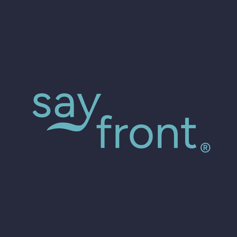
Say Front’s current logo
I sat with this concept for a few more weeks and embraced that Say Front is an unconventional brand. It's not an easy logo to place because its alignment follows what looks right to the eye rather than perfect center.
The stagger gives the name room to play, which the serif never allowed. The logo now looks the way Say Front sounds: approachable, collaborative, and honest, with a little humor in how it's said.
If this is how you'd want your brand approached, I'd love to hear about your business.