Jump to section:
Color • Logo • Typography • Voice
Inspiration
The Say Front brand inspiration came from a notebook cover. It was a deep navy blue hue with a hint of cyan. As I explored complementary colors, I was drawn to a vibrant cyan that echoed the colorful energy of my home, Long Beach, CA. This homage to my city became the essence of the Say Front brand.
In the following guidelines, you’ll discover the reasoning behind each design choice. While I recommend adhering to these specifications for brand consistency, I also welcome creative interpretations in areas like line and paragraph spacing.
I placed these brand guidelines for public view because its contents will change and evolve as Say Front grows. Check back occasionally to ensure you’re using the Say Front brand correctly.
For clarification on special-use situations, please contact me at marketing@sayfront.com.
Color
When developing branding for any small business, I start with the color palette. Color choices speak deeply to emotions and guide us in creating the remaining elements of the brand. I select colors from Pantone for various reasons. First, the names of the colors often have emotional associations that align with the brand’s identity. Second, using Pantone helps us maintain consistency across web and print media. These carefully chosen colors then inform our decisions on typography, imagery, and overall design aesthetic.
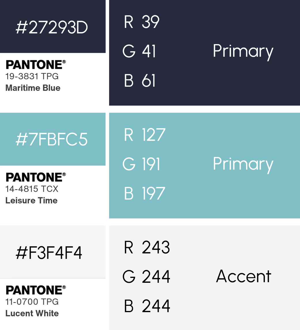
Our Color Palette
Maritime Blue is a rich, dark blue hue that emanates trust and sophistication. The depth of the color communicates stability and constancy.
While Leisure Time is a vibrant cyan blue shade reminiscent of clear skies and calm waters, speaking to our commitment to transparency and openness in communication, where ideas are freely shared.
As an accent color, Lucent White is a cool-toned white with subtle depth and a slight gray undertone that evokes a sense of calm and clarity.
Our Primary Logo
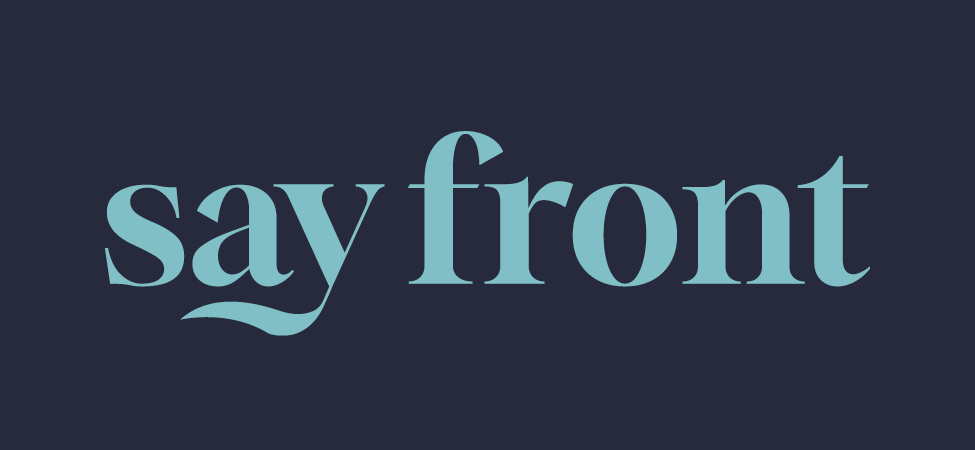
The logo primarily appears in Leisure Time cyan on a Maritime Blue background. This high-contrast combination ensures visibility while embodying the brand’s energy and professionalism.
I incorporated various serif fonts in the development of ‘say front’. The wavy element to the ‘y’ breaks the rigidity of the typeface and softens the look and feel of the brand.
Document Logo
For most document uses, the logo should appear in Maritime Blue. This choice helps maintain visual simplicity.
Alternative Logos
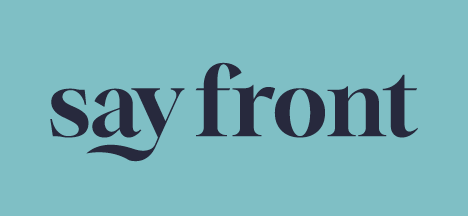
Sometimes the Maritime Blue logo appears on a Leisure Time background. This usage is rare and typically occurs in our social media graphics.
Clearspace
To ensure the logo remains visually distinct and free of distractions, I require clearspace to allow our logo to breathe. The clearspace for the “say front” logo is defined using the lowercase “o” from the logo itself. This clearspace extends the width and height of one “o” on all sides of the logo, ensuring consistent breathing room that scales proportionally with the logo size across different applications.
Typography
When I select fonts for brand I work on, I ensure they are web friendly or accessible from sources like Google Fonts or Adobe Fonts. In Say Front’s case, I selected the fonts from Google Fonts to ensure they properly integrate to the website.
Titles & Headers
DM Serif comes in two versions. I selected the Text version over the Display version for its lower contrast and ease of readability. The font has a modern yet classic feel, with sharp serifs and a slightly condensed look that makes it stand out in headlines and titles.
Designed by the Colophon Foundry.
Subheaders & Accents
To balance DM Serif Text, I paired it with Urbanist—a low-contrast, geometric sans-serif. Characterized by its clean lines and minimalist design, it lends itself to the Say Front personality.
Designed by Corey Hu.
Body Texts
I selected Open Sans for its excellent readability. It’s a humanist sans-serif typeface, which means it has a more organic and less geometric design compared to many other sans-serif fonts.
Designed by Steve Matteson.
The Say Front Voice
Human
As an empathetic creative, I stick to language that is relatable and easy to understand.
But, sometimes, I may get carried away with the creative writing.
Helpful
I am the friend who makes life easier by providing valuable information and solutions, offering guidance and support, and explaining complex ideas in accessible ways.
Friendly
Being approachable and personable isn’t just what I do – it’s who I am.
Humble
I actively listen to feedback, acknowledge my mistakes, and give credit where it’s due.

Let’s Meet
Want to establish your own brand guidelines? Book time with me below.